Modern Economic Statistics and Imperialism
I was asked to put together modern statistics on imperialism. With Claude's help I have assembled these, which should be illustrative.
Banking concentration
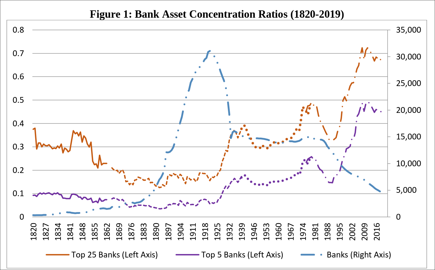
Source: Fohlin & Jaremski (2020), "U.S. banking concentration, 1820–2019," Economics Letters vol. 190, DOI 10.1016/j.econlet.2020.109104. Authors' Figure 1.
Bank concentration in the United States has risen steadily since the mid-1920s. The top 5 US banks now account for almost half of all assets, and the number of banks has declined from a peak of over 30,000 to around 4,500 in 2019.
Steel production
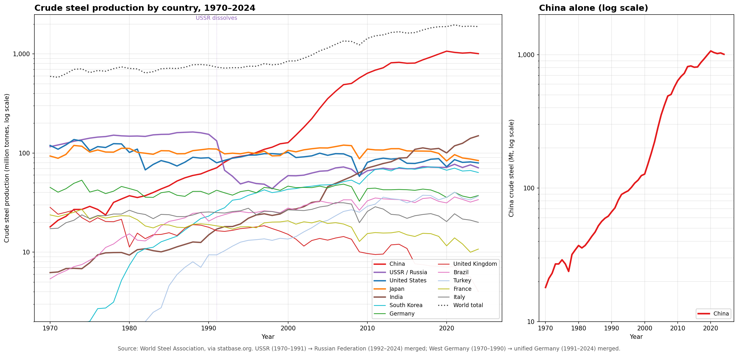
Source: World Steel Association via statbase.org.
Steel production is the best modern equivalent of Lenin's pig iron figures. The big story here is China, which surpassed the US in 1996 and now produces about 7× as much steel as India (the next-largest producer) and 12× as much as Japan.
Export of capital
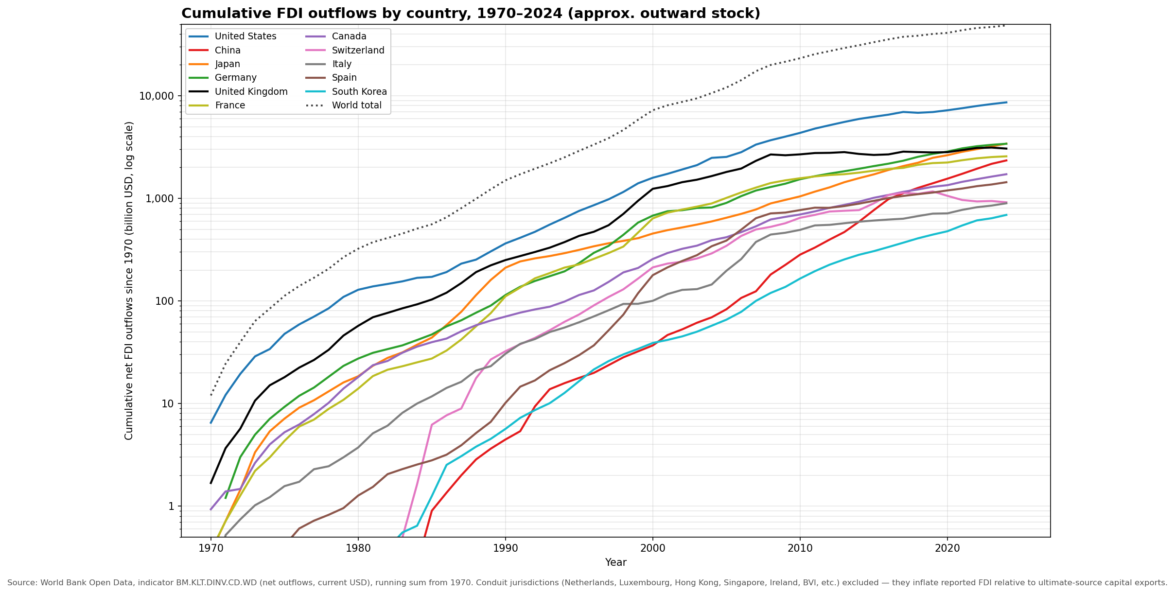
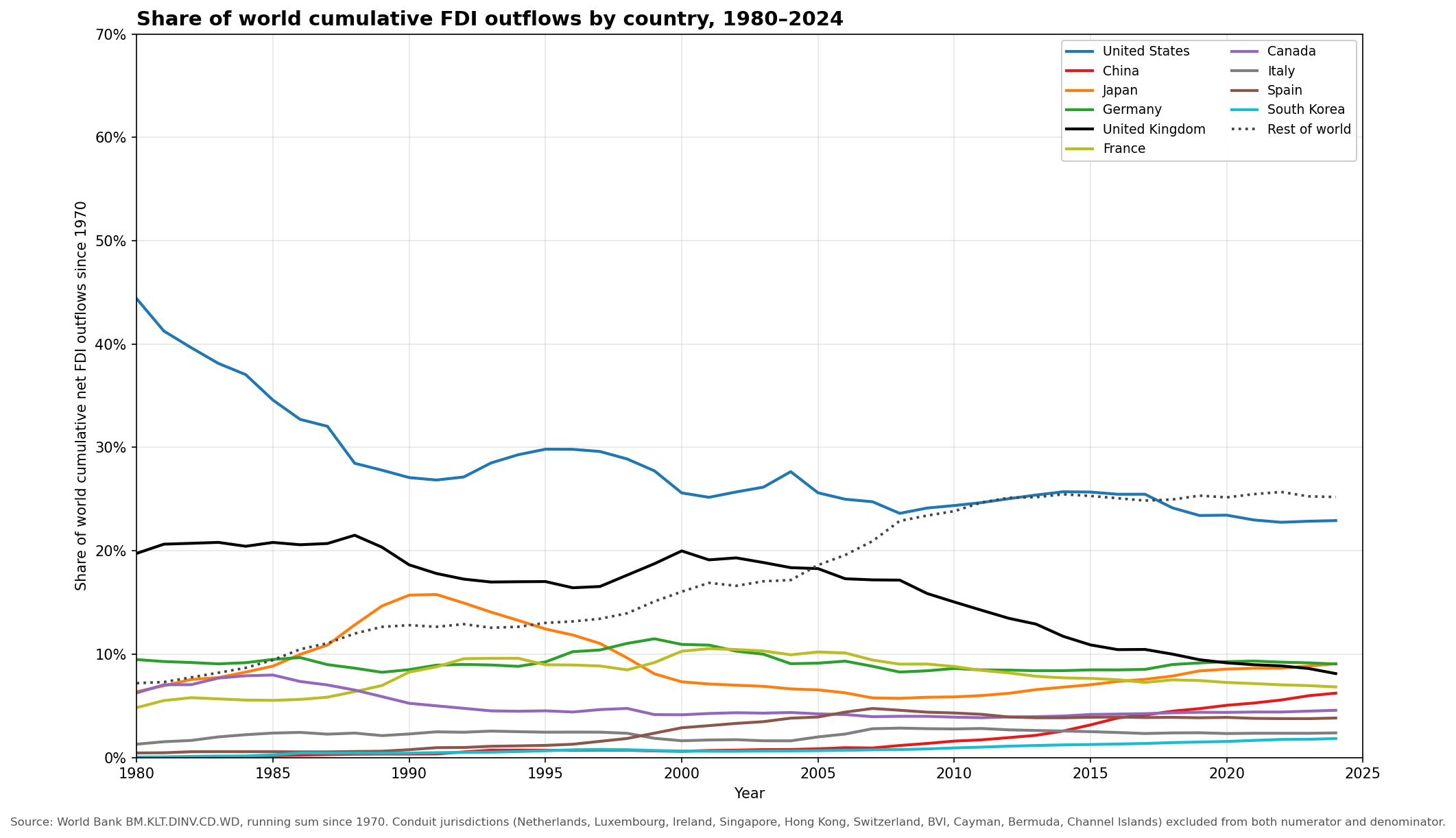
Source: World Bank Open Data, indicator BM.KLT.DINV.CD.WD (FDI net outflows, current USD).
World Foreign Direct Investment has increased by roughly two orders of magnitude since the 1970s. Over this period the major trends have been
- The decline of the US position in foreign direct investment (though it's still dominant)
- The decline of the United Kingdom
- The rise of China from negligible to about 6% of world share, putting it in the pack of secondary investors.
Tribute
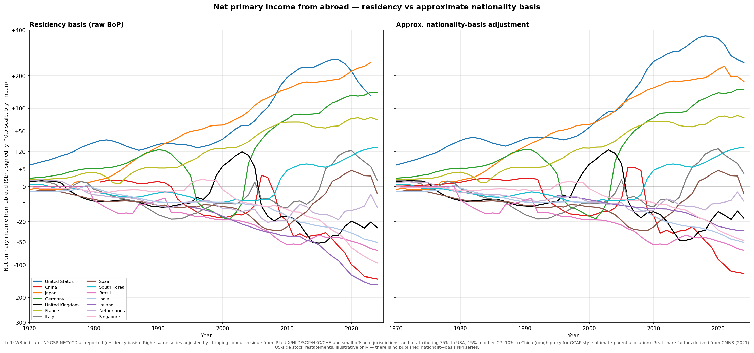
Source: World Bank Open Data, indicator NY.GSR.NFCY.CD; nationality adjustment uses CMNS (2021) restatement factors applied to conduit jurisdictions.
The US, Japan, Germany, and France are the largest recipients of tribute. Raw balance-of-payments data puts Japan at the top in recent years, but exact accounting is significantly obfuscated by the trend towards tax-haven structuring — and once we strip the conduit residue and re-attribute it to the ultimate parent country, the US returns to the largest position by a comfortable margin.
Where the capital lands
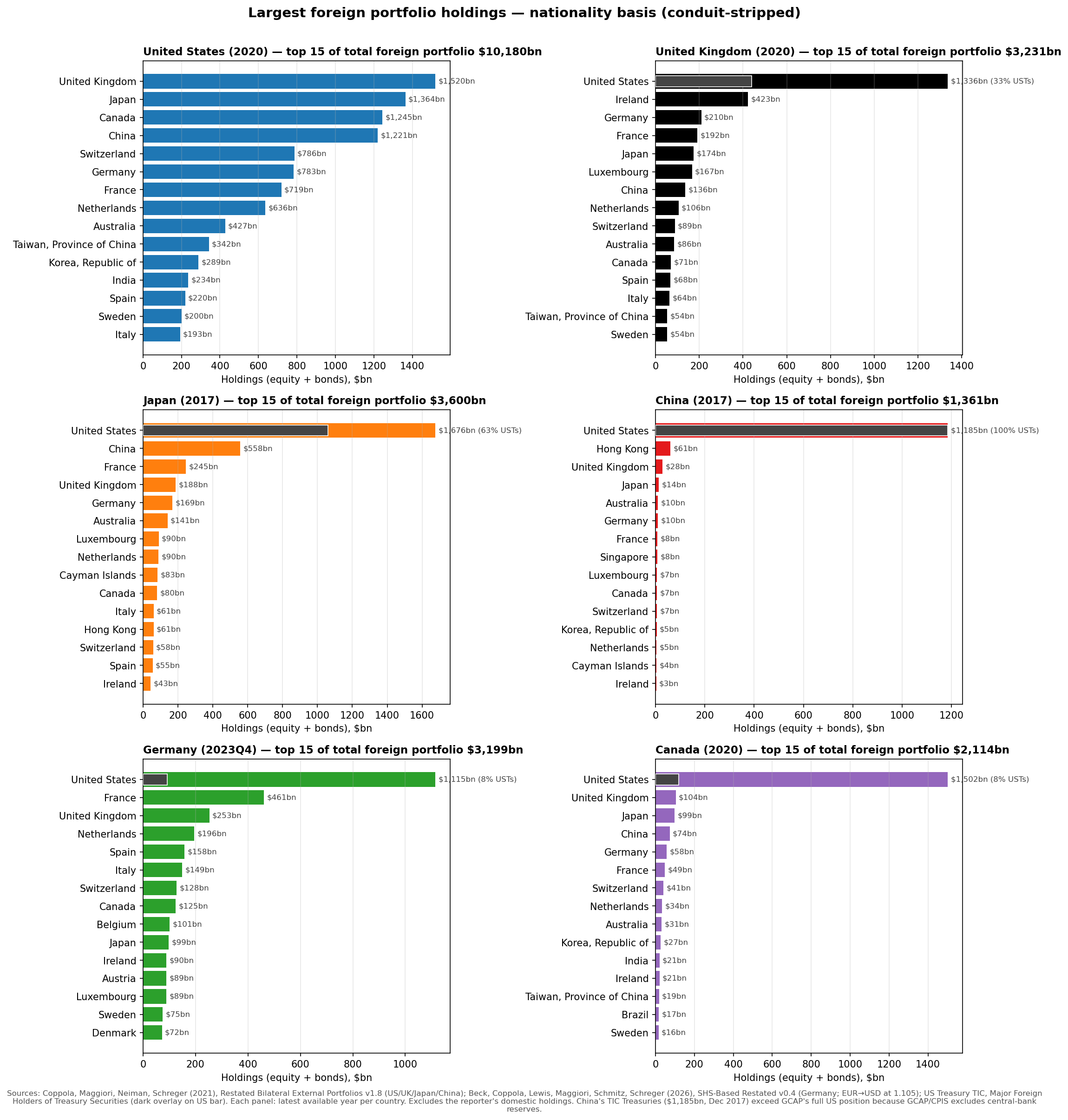
Sources: Coppola, Maggiori, Neiman, Schreger (2021), "Redrawing the Map of Global Capital Flows," QJE, via Global Capital Allocation Project. Germany via Beck et al. (2026), SHS-Based Restated Bilateral External Portfolios v0.4. US Treasury holdings from US Treasury TIC, Major Foreign Holders of Treasury Securities. Each panel shows the latest available year per country (US/UK/Canada 2020; Japan/China 2017; Germany 2023Q4). For China, TIC Treasury holdings ($1,185bn) exceed GCAP's full US position ($152bn) because CPIS excludes central-bank reserves; the China bar is extended to the TIC value.
| Country | Year | Total US holdings | of which Treasuries | Treasury share |
|---|---|---|---|---|
| Japan | 2017 | $1,676bn | $1,062bn | 63% |
| UK | 2020 | $1,336bn | $441bn | 33% |
| Germany | 2023 | $1,115bn | $92bn | 8% |
| Canada | 2020 | $1,502bn | $120bn | 8% |
| China | 2017 | (mostly reserves) | $1,185bn | ~100% |
I have highlighted the share of portfolios which is composed of US Treasuries as they should probably not be considered productive assets but rather a structural feature of dollar dominance.
The United States' portfolio holdings look qualitatively different from any other country. The other major countries depicted here all have the United States as their primary portfolio holding. The US, on the other hand, has diverse investments.
A notable feature of these portfolio allocations is that all the largest holdings are within the developed world.
Canadians will notice that Canada is essentially not diversified at all.
Rentier nations
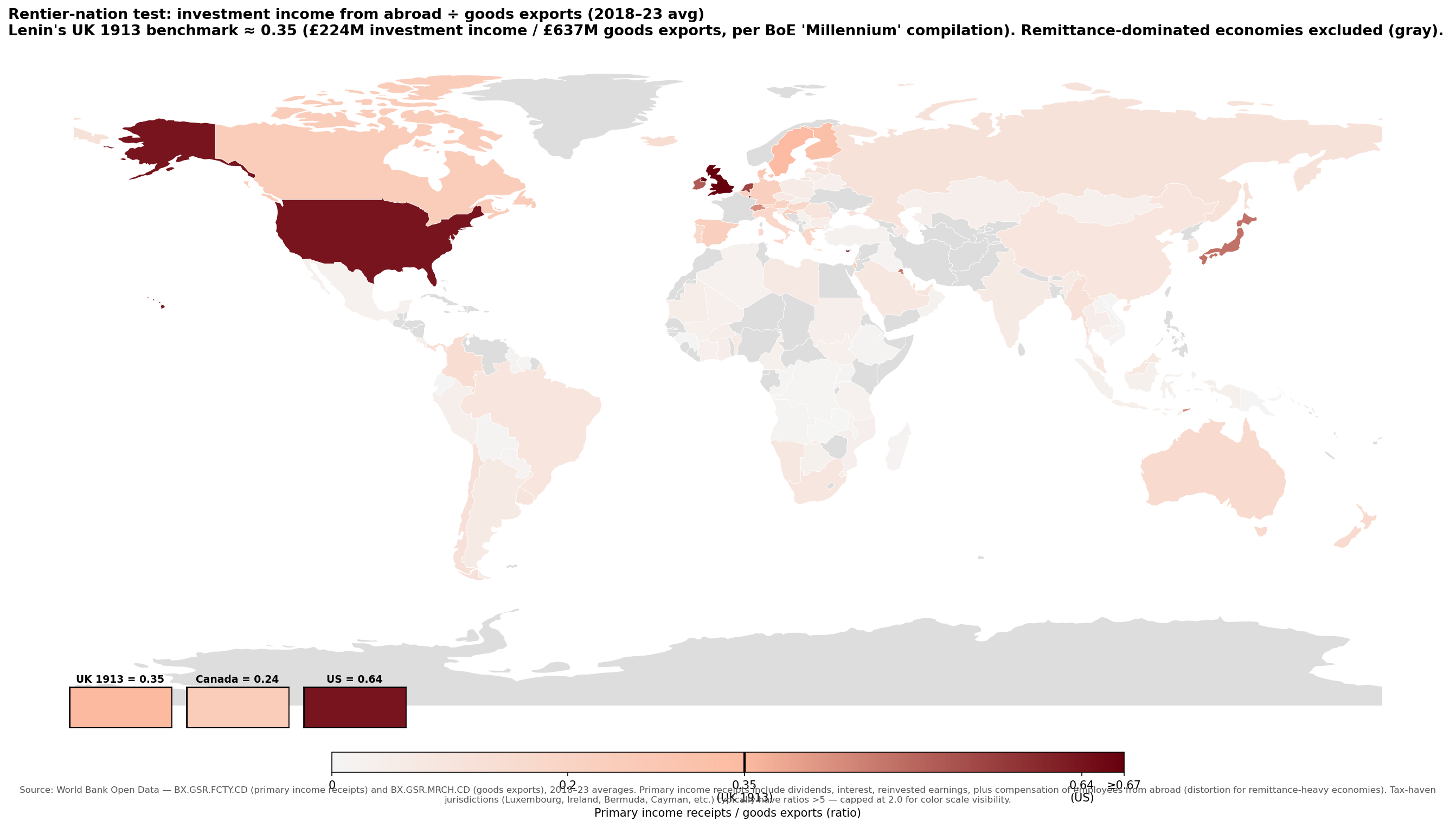
Source: World Bank Open Data — BX.GSR.FCTY.CD (primary income receipts) and BX.GSR.MRCH.CD (goods exports). UK 1913 benchmark sourced to Bank of England, "A Millennium of Macroeconomic Data for the UK," sheet A36 (£224M investment income receipts ÷ £637M goods exports). Original sources: Imlah (1958), Feinstein (1972).
This map really highlights that the world is composed of a small number of rentier states, which are far more reliant on investment income from abroad than England was in Lenin's time. For the US and UK, the ratio of primary income receipts to goods exports is nearly double that of the UK in 1913. Then there are the borderline cases like Hong Kong, Sweden, Norway, and Singapore which sit at or just below the UK 1913 line. Wealthy goods exporters like Canada, Australia, and Germany have meaningful investment income but well below the rentier threshold. Finally the majority of countries receive negligible primary income from abroad.
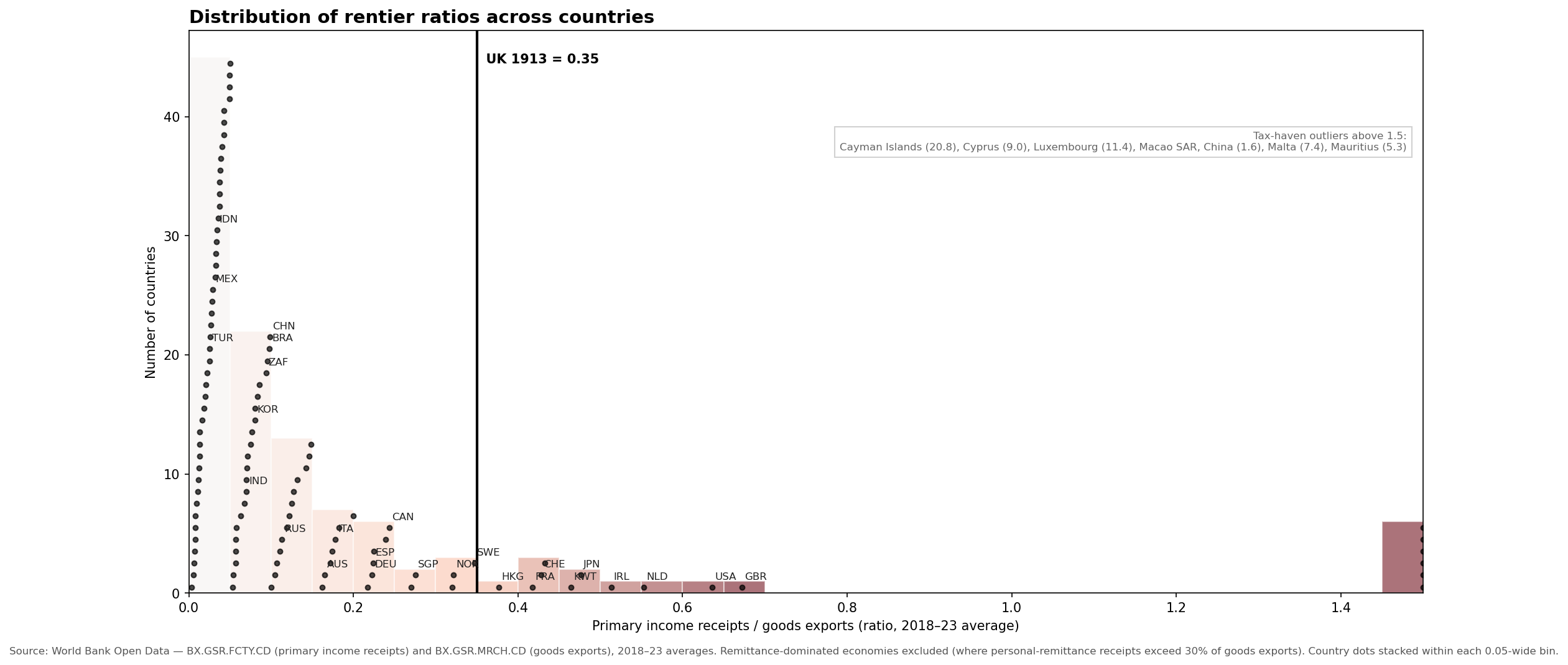
Source: same as the map above. 114 countries shown; remittance-dominated economies excluded.
The distribution of rentier income exhibits a significant right skew reflecting that a small number of countries extract a lot of rent, whereas a lot of countries extract almost no rent.
Rate of return on foreign capital, major capital-exporting economies vs UK 1913:
| Country | Year | IIP gross assets | Investment income receipts | Implied yield |
|---|---|---|---|---|
| UK 1913 | 1913 | £4,000M | £224M | 5.6% |
| Spain | 2024 | $3.3T | $137bn | 4.11% |
| United States | 2024 | $35.7T | $1,451bn | 4.06% |
| Switzerland | 2024 | $5.8T | $237bn | 4.06% |
| Japan | 2024 | $10.6T | $429bn | 4.03% |
| Netherlands | 2024 | $10.5T | $423bn | 4.01% |
| France | 2024 | $11.2T | $405bn | 3.61% |
| Italy | 2024 | $4.2T | $140bn | 3.37% |
| Germany | 2024 | $14.4T | $467bn | 3.24% |
| China | 2024 | $10.2T | $309bn | 3.03% |
| United Kingdom | 2024 | $18.2T | $536bn | 2.94% |
| South Korea | 2024 | $2.5T | $72bn | 2.86% |
| Canada | 2024 | $7.2T | $186bn | 2.58% |
| Australia | 2024 | $2.7T | $70bn | 2.57% |
Source: IIP assets from IMF Balance of Payments (indicator IA_BP6_USD); investment income from World Bank (BX.GSR.FCTY.CD). UK 1913 from BoE "Millennium" compilation, sheet A36.
Rates of return are universally lower than in 1913. The United States receives some of the best returns on its assets in addition to having the largest pool of investments, which reflects its privileged position in the financial system.